Gate-X Fitness Club
Freya Architects · Moscow - Russia
New Talent Award 2026
Category Winner 2026
Overview
GATE-X is more than just a fitness club; it's a portal to an alternative reality inspired by the aesthetics of futurism, science fiction, and dystopian philosophy. The space is built on a sense of transition, transformation, and strength—both physical and mental.
Idea and Concept The main metaphor is "the gateway to your future self." GATE-X is a transitional space where people become stronger, more confident, and closer to their best selves every day. The idea of transformation is conveyed through architectural imagery: • Portals and corridors as a symbol of forward movement • Skylights as direction and energy • Monolithic forms as stability and strength • The contrast of light and shadow as a symbol of inner struggle and overcoming
Colors and Materials Basic Palette: • Anthracite and metal – technological sophistication, cool energy, the industrial spirit of the future • White and concrete – neutrality, purity, foundation • Semi-matte reflective textures – create the illusion of space and "virtuality" Accent Colors: • Deep blue (ultramarine) – associations with space, silence, and intelligence • Neon orange – a sharp pulse of energy, adrenaline, and focus • Colored light/neon – creates the effect of technological sophistication and transport to another world
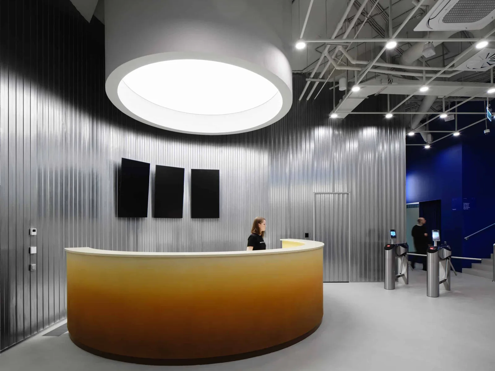
Functional Zones and Atmosphere 1. Reception Area — Symmetrical composition, soft gradient of light on a relief Glass, a monumental reception. The feeling of entering another reality. 2. Waiting Area — Integrated benches, space terminal style, a reference to sci-fi interfaces. 3. Showers and Locker Rooms — Contrasting materials, dramatic light from the ceiling (a catabolic tunnel effect), reminiscent of scenes from "Prometheus" or "The Expanse." 4. Fitness Area and Open Space — Cold industrial materials (corrugated metal), functionality. The feeling of a training facility of the future—like in "Oblivion," "Blade Runner 2049," or the training areas from "The Hunger Games." 5. Orange Area (bar/snack area) — A pulse of color, a symbol of a reboot. A space within a space. Echoes of "2001: A Space Odyssey," where color plays a decisive role.
Futuristic references and inspiration: • "Blade Runner 2049" — cold neon, scale, a sense of loneliness in a hyper-technological environment • "Oblivion" — monochrome spaces and light portals • "Expansion" / "Prometheus" — corridors as a path, architecture as philosophy • "Tron: Legacy" — lighting graphics, interface space • "The Hunger Games" (Capitol) — the contrast of rigid geometry and emotional light
Key principles: • Contrast: light and shadow, noise and silence, movement and pause • Transparency and reflection: as a symbol of openness and mirrors of progress • Lighting scenarios: atmospheric control, supporting various states — from pre-workout excitement to post-workout meditation
If you prefer, I can also format this text into a presentation format or shorten it for a website or publication.
For the website Project Concept GATE-X is not just a fitness club, but a spatial scenario for personal transformation. We conceived it as a portal to an alternative reality—a world where body and mind are sharpened, discipline becomes a driving force, and architecture acts as a catalyst for inner growth. The central metaphor is "the gateway to your future self." The space guides, inspires, and pushes toward personal evolution.
Atmosphere and Visual Language The project references the aesthetics of futurism and dystopia. Inspired by the visuals of Blade Runner 2049, Prometheus, Oblivion, TRON: Legacy, and The Expanse. Every element—from the light to the texture—creates a sense of immersion in a future world where sport is not just physical activity but a philosophy of survival, order, and strength.
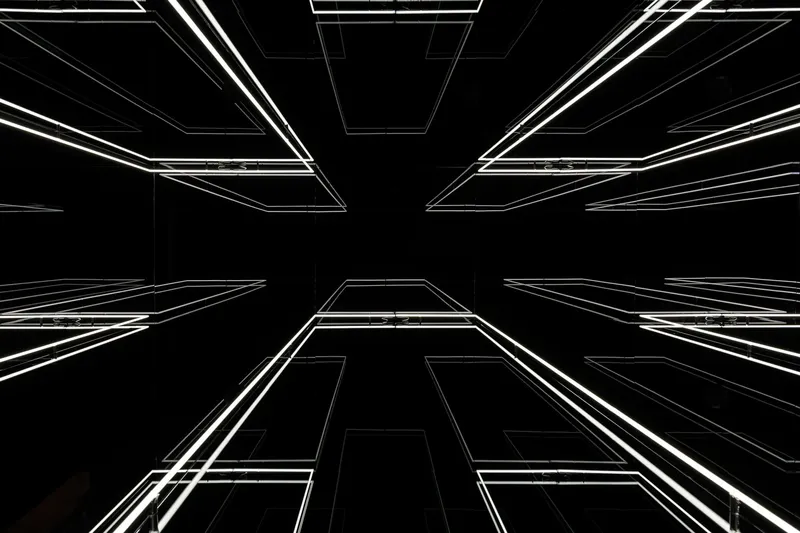
Color and Materials • The basic palette: anthracite, cool metal, and white concrete—create a sense of technology and structure. • Texture: semi-matte reflections, textured glass, rough concrete. • Accents: ultramarine as the color of depth and silence; neon orange as a pulse of energy. • Lighting: scripted, architectural, with dramatic elements—from directed catabolic light in the showers to light portals in the corridors.
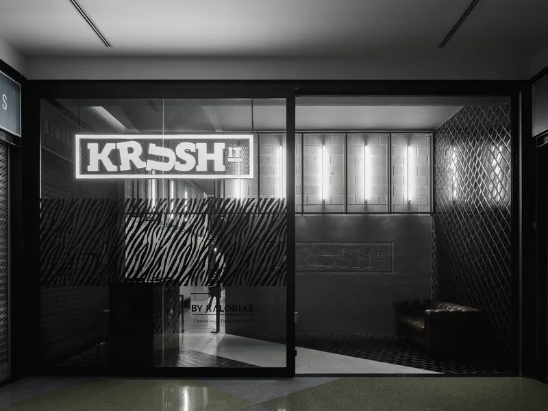
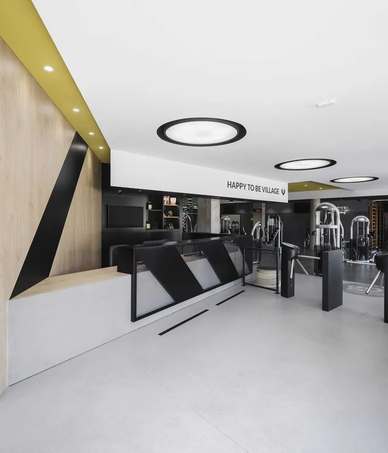
Key Spaces • Reception: monolithic, symmetrical, translucent gradient—the club's first impression is like that of a space station. • Showers and changing rooms: clean lines, concrete, a solid blue ceiling, dynamic light—a space for transformation. • Functional zones: the gym, open space, and waiting areas are integrated into the architectural shell—no unnecessary media, navigation and furniture are built into the monolith. • Bright portal (bar area): an orange cube as an architectural explosion in a calm environment—a point of reset and ritual.
- Studio
- Freya Architects
- Website
- freyaarchitects.com
- Location
- Moscow - Russia
- Edition
- 2026
- Discipline
- Interior Design
- Category
- Spa & Fitness
Project credits
- Lead Designer
- Kristina Koivistoinen-Khatlamadzhiian
- Team
- Marina Rudneva, Anastasia Tkachenko, ArchFunk - Ilya Sazhin
- Consultants
- ArchFunk - Ilya Sazhin
- Photography
- Maxim Loskutov
Gallery
08 imagesRecognised by LOOP
2026
New Talent Award
Interior Design
Spa & Fitness
2026
Category Winner
Interior Design
Spa & Fitness