Client Opportunity Map
McKinsey and company · Boston USA
Design of the Year 2024
Category Winner 2024
Overview
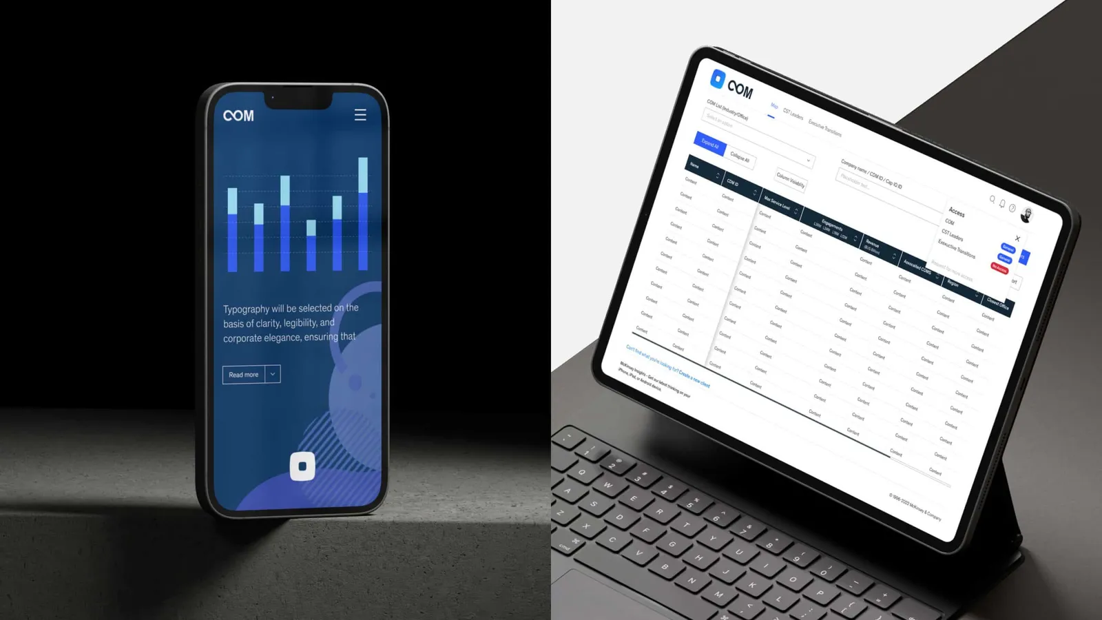
The “McKinsey Client Opportunity Map” is an innovative brand identity project designed to highlight the infinite potential and continuous possibilities within client opportunities. The logo symbolizes infinity and potential, while the color palette aligns with McKinsey’s core values, enhancing visual identity, establishing hierarchy, and conveying meaning. Thoughtfully applied colors express McKinsey’s identity, guide users through experiences, and indicate state changes in interactive elements. McKinsey’s custom typefaces, Bower and McKinsey Sans, combine to create a distinctive and purposeful voice, using extreme contrast for engaging, high-impact presentations. This project reinforces McKinsey’s commitment to excellence, innovation, and client-centric solutions, enhancing brand recognition and reinforcing its position as a global consulting leader.
- Studio
- McKinsey and company
- Website
- mckinsey.com
- Location
- Boston USA
- Edition
- 2024
- Discipline
- Graphic Design
- Category
- Branding & Identity Design
Project credits
- Lead Designer
- Lei Ye
Gallery
07 imagesRecognised by LOOP
2024
Design of the Year
Graphic Design
Branding & Identity Design
2024
Category Winner
Graphic Design
Branding & Identity Design